
And I welcome anyone that want to take a look, just peruse around my "house" or add her/his own comment into the matter.
Let's start from the basics:
If you take note to my very first creation then...

1) Its a cap, nuff said, but there are two elements that distinguish a cap from a (long) story with images.
A) A single image that pretty much scream: cap me!
B) A short text with a "meaningful" story to set you "fast" into the TG elements
Now that would be nice, if It weren't for we are, actually in the 21st Century, and the programs to make just anything are quite evolved.
This is nevertheless a basic way to start a cap and the ground is solid to flow better from there... not everyone is a genious to grasp on everything.
But lets talks about its forte and weaknesses:
If we avoid the part that I'm a second language user with English and that I'm primarily a native Spanish user then I cut down to you: The proper spelling, rough english, correct forms of grammar and spelling, typos and a large etc. In that matter.
We are here to concentrate on the elements to make a "capper" out of you yet!.
We got colours to differentiate the two speakers. The soft colour which is pink was used to determine the weak one. We want to exalt the power of the mistress in the story or master if you prefer (I'm not going to argue to who you serve!) for that we will tend to use rougher colours like black or distinctive colours like purple, but thats come from the preferences of anyone, I'm just helping you out a little.
Then we will build the story: Basically you want to talk about a weak willed specimen... which is me in the story thank you! and set from there to where your imagination will want to take you.
Its important that if you are going to use a humilliation or submission element in a story, you need to "measure" How much of it you are going to use. You don't want readers to start seeing something that to midway of the reading dissapear because they weren't advised of it!.
For me this come down as the basic submission plot, with some new elements of uptake but, of course that doesn't appear here so onto... the story.
Now you got the two characters and their wills set, and now comes the hard part where pretty much a lot of people find a stalemate...
-"Well yes, she is a sub I'll take that, but now what? I transformed her, what to do with her?, Shall I keep measuring her possibilities to what she will do or not? What's the purpose anyway?."-
There is not a safe answer to that because that lies into the imagination. You can be born with a writer soul and you came tame yourself to be a great writer but, you cannot force yourself to be a writer nor become a great writer witouth the inspiration needed. You just can't force that, which means you'll take pain in writing such a long stuff like this one, in the first place.
Now comes the imagery ability to ponder the interest of others.
You don't need to be a great pic hunter, but if you are not sure, finding pics that scream beauty from every side of it, does help. Then again its comes to different tastes. If you are not sure, stick with the pretty ones!.
Of course to bond a pic with a story is no easy task, normally we would tend to think:
-" I can find a pic, then I'll write the story"- or -"I have a story but the pic don't match"-
Nor the first nor the second will work in every situation. You need to be secure of how to match those two as these is a slippery terrain.
Now why this caption is not of high quality according to my standards?
Its simple, it doesn't describe who can be the talker if we take off the colour, the characters are pretty much devoid of action and reasoning. Its pretty much a "suit yourself" caption.
But don't worry you'll do great if you try.
Now lets keep with the second phase of how I do captions:

Please once again avoid the part of bad spelling, quotation, etc...
Now this one is a regular caption; Its has a story or back story, it has a character that is being built from the start:
Lex is a fanatic of videogames and would love to get the last one, which deals with virtual reality, something goes wrong and his mind gets confused with a character from the game, darth vader in this case and the machine forgets to add a male variable to his body and makes him a girl... with a wicked and fucked up persona.
Details, details, details...
Some despise them and some other loves them. The correct use of those are the key point to become a top captioner.
If you fall into the latter group then you will know at some point how to measure the quantity of it.
This comes as a balance of being descriptive and not extremely boring, because everyone is here, for the actual transformation!
We don't need colours as in this one the character is depicted by a narrator and this one would get confused with another individual if we use colours at some key points.
This is indeed not a great caption for two very good reasons.
The constant use of commas instead of punctuation and the run on sentences, pretty much all the time without explanation. And the actual flow of the transformation to make Lex into the other gender.
I know those were my weaknesses (and at some points they are still mine!) and you cannot avoid but to grasp on how to make the transformation flow... From now even I try to disguise that with some secondary elements while doing so. Some others now exactly how to connect each part of the body and make a natural flow into the transformation... so in that matter choose your poison!.
Phase Three:

Please once again avoid the grammar issues ^-^
If you made it this far you got a plot in your hands.
In this one the backstory is fleshed out to the very end and we would make a movie out of this. So kudos for you if you can do this ^-^
No, but really the important part comes from the evident. The Pic is now "standarized" and the background of the text box now has a life!.
It's important to not underestimate the value of a good background. This is ignored by many of others captioners (Which I don't have a problem with it) but you are losing an important ally into the battle of readibility. Matching the box with the letters is an art... which turn out to be more difficult the moment you complicate things in a cap!.
This would make for an important step into being an actual captioner with some success but if you want to go further, try to go higher!
Phase four:

This is a combination of the before mentioned elements to create a "quality cap" Now we see that the pink is pretty much a standard for the weak willed (Bimbo in this case) Purple for the mistress and black for the narrator. Add a smooth colour for the background and your eyes will thank you for an easy reading. Then add the image with an element that connect the story: In this case the phone!.
Phase five:
You can't really do much more with this program, but I'll tell you it holds some stuff to try around... we had seen only the simple elements.
Take note that this was done before the previous one... so some errors, that you didn't see may appear in this one! ^-^


Now did you see all that? hehe sex sells right? ^-^
That pretty much complicating your life more than the usual, but for this one I put the program to the limit!
Notice the characters have their names before they speak?
A good trick if you are not planning on adding colours to them, afterall they are "devoided of soul" (Please understand that as they are not important at their current state or also not constructed into the actual story)... and some people despise colours because they find it distracting.
I don't like much showing up all the smut in all its glory but sex sells right! ^-^
Also this story is heavily based on the pictures as the actual story is built from the own imagination of the reader... yeah, yeah get all that naughty, you perv! *giggle*
Phase six:


Now we got a pretty "not naughty" (what a change right?) cap with the background taking a life on its own. If you do it right, the background can tell an emotion of the character... and thats plays an important role on how you set the tone of the story.
Phase seven:


In order to not mess the story... read it from left to right... if you want to read it!
Now despite some actual punctuations errors... some on purpose and some others not and one typo I actually caught today *sigh* This story is a good set up for a further explanation and advance into making a cap.
Not before you drop your eyes because its a series and with a well thought story... I'll tell you its good for two very good reasons:
1) I added a secondary background to make more stable the position of the text box and the picture box. Now the background text is not important here because there are four or five personas with one character. This is tricky indeed but, if done right... It will be a success!
Apart from the long monologue of the different Evie's persona it's important to notice that there is not an actual dominant side of the situation as the character pretty lets himself/herself drive by the events. Good point for creating a backstory and fill it with sensual passion and eroticism. Just for showing sex doesn't make you a good captioner.
Phase eight:

If I didn't bored you to death for now... lets go with an actual change of program.
The importance of a title. It has come to my attention that adding a title does help to the caption to speak for itself. Whether if you want to confuse the reader intentionally or not.
Forgot to say that now the characters will always start their sentences and finish them like in any book -""- ... for that matter that's pretty much how its added in a spanish book. Now if a character is driven by a narrator it would have to be followed up by: -""- -Wathever the action- -""- to distinguish better between the talking and the action. (I didn't do that yet, because I'm not doing narrator's + character filled into a cap yet!)
Its also a good point to my own style, because from this one I learnt on how to fiddle with Quark's controls to enhance a caption with the pic/s and with the text. Note the translucid text box? Its a good trick to make a marry between a pic box and a text box without messing with it!.
Phase nine:

Now lets get all colourful and notice how Quark can help you to that ^^
There is a title, there is a bit of pic manipulation... we want Courtney to be big right? Afterall she is wearing ballet boots! and also adding a mixture of differents tones of pink but without battling against each other. Thanks again to the translucent window of the text box.
Which add to the inclusion of who made the cap too.
Notice that adding theatrical elements to the speaking is a forte of mine. So the sensation of rush and slow between moments is good for the creation of a great story.
Phase Ten:
If you didn't die from cuteness in the previous one, good for you *giggle*
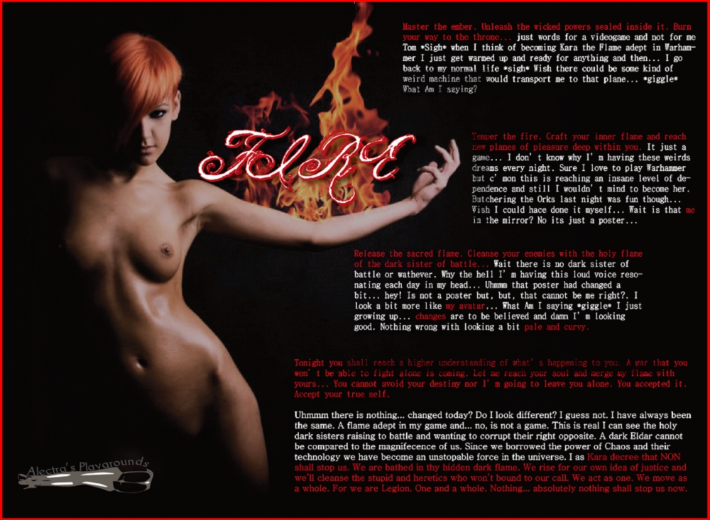
First there is no support from a text box as the translucid system is lost in here. You need to support yourself from a good strong colour (in this case the resemblance of fire) and play around with it. This is very tricky to do, but if done well... the results are as you can see: spectacular!!!
Also introducing my signature for every cap since now. Thanks to Caitlyn for the help of creating it! ^-^
Phase Eleven:
Well that's more optional, if you plan to go less creative and feel yourself in a "mortal ground" lets go with this one:

This is a regular nowadays caption. Two pics, and the text box is translucent to support a pic as a background. With some support from a changing text to add to the illusion of someone getting more and more feminine.
Also a striking title does help... once again adding a joke somewhere creates a funny environment for the cap ^-^
The inclusion of *giggles*, *grins*, *smirk*, etc. And whatever element you can think of for an action, helps to the flow of the character. Not just being an automaton devoid of sentiments... at least on my opinion.
Phase Twelve:
-"WAIT! there is another phase? you never spoke of that one!"-
Well not really but, this add for an ever flowing evolution on my caps.
Enjoy!

I don't know where I would end up from there, but may this long explanation help you on making better caps... or help you in actually doing them!.
For an actual: how to step by step do a cap on Quark. That would have to wait... but I'm planning on doing so!
SCREW IT QUARK *Giggle*
Here is the real deal. I finally learned Photoshop. I won't call myself a pro, but I have already done pro-works in the business side of things ^^
Learning Photoshop is a whole different beast, and I hope this improve the aesthetic of my captions.

Here you can see a little proof of concept - and also an image for a story in the works - I won't go on how easy or difficult it can turn out to be managing Photoshop but here's to a better improvement anyday.
Now take a look at an actual caption done in Photoshop

 One drawback from writing in
Photoshop is the stretching text,
which doesn't happen in Quark.
Overall the text can be manipulated much better though.
It takes longer to write something too...
Thanks for reading it!
Wonderful direction Alectra! I think that will be a great help to cappers both new and experienced!
ReplyDeleteLovely and very helpful guide. I'm sure there are a LOT of people who could learn a thing or two here :) I would, but I'm just a ditzy redhead :)
ReplyDeleteAwesome work!